A great deal of thought is being put into restaurant menus these days. A recent New York Times article by Sarah Kershaw reported that restaurants are overhauling their bills of fare to make them more appealing to spending-spooked diners.
Briefly, these are the rules restaurants are using to make their recession revisions.
Good:
A menu cameo by Mom, Grandma, or your Great Aunt Millie
According to the article, "people like the names of mothers, grandmothers and other relatives on their menus, and research shows they are much more likely to buy." She doesn't mention whether male relatives' names have the same effect, but somehow I doubt it.
"Enhancers."
Enhancers are those magical ingredients like "applewood smoked bacon" that turn a dish into menu gold. According to Danny Meyer this is what makes chicken liver sound chic. Hm.
Romance.
Stick words like "smokehouse," "country," or "farm fresh" before your bacon, ham or eggs and you've won your diner's heart and wallet.
The Top Right.
This spot on the menu is where the eyes are drawn, and so it's where a smart restaurant will stick its most profitable items.
Bad:

Dollar signs.
Krenshaw says that, "in the world of menu engineering and pricing, a dollar sign is pretty much the worst thing you can put on a menu, particularly at a high-end restaurant."
Zeros.
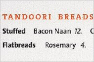
Dr. Sheryll Kimes and other researchers at Cornell conducted a study comparing sales at restaurants with various menu formats: four digits and a dollar sign ("$17.00"), two digits and no dollar sign ("17."), and written prices ("seventeen dollars").
They found that guests given the two-digit numeral menu (17.) spent significantly more than those given either of the other two menu formats.
Gray and Purple
These colors stimulate satiation, while blue and gray stimulate appetite.
No comments:
Post a Comment